INSPIRATION
24 of the Biggest Graphic Design Trends for 2024
Stay ahead of the curve and get ready for the new year with 24 of the biggest graphic design trends for 2024.
Nov 1, 2023
•
8 min read
In today’s digital-first world, where creativity and technology are going hand in hand, graphic design continues to reinvent itself. Whether you're a seasoned designer or just starting out, 2025 promises to be a thrilling year filled with fresh ideas, bold statements, and new ways of seeing and shaping the world around us.
In this Trendbook 2025 edition, we’ll guide you through the key graphic design trends that are set to define the year ahead. From playful colors and patterns to cutting-edge 3D elements, we’ll explore the trends that are helping brands and creatives connect, inspire, and communicate in new ways. Think of this as your sneak peek into the visual direction of the year, and a source of inspiration as you dive into your next project.
Want to see how trends have evolved? Be sure to check out our reports from 2022, 2023, and 2024, too!
Here are 25 graphic design trends to keep on your radar in 2025.
This graphic design trend is still a major one in 2025, proving that simplicity doesn't necessarily mean playing it safe. This fresh take on minimalist design combines clean compositions with unexpected elements that pack a punch. While traditional minimalism whispers, this approach knows exactly when to shout.


What makes it click with today's audiences? It's all about finding that sweet spot between clarity and impact. Designers are getting braver with their choices, using bigger typography, stronger contrasts, and carefully picked colors that work together to create something that feels both timeless and totally current.

The cool thing about bold minimalism is how versatile it is. It works for both digital and print, and it's becoming a go-to choice for brands that want to stand out without overcomplicating things. In a world full of noise, this graphic design style shows us that sometimes the boldest statement is also the clearest one.
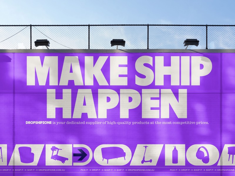


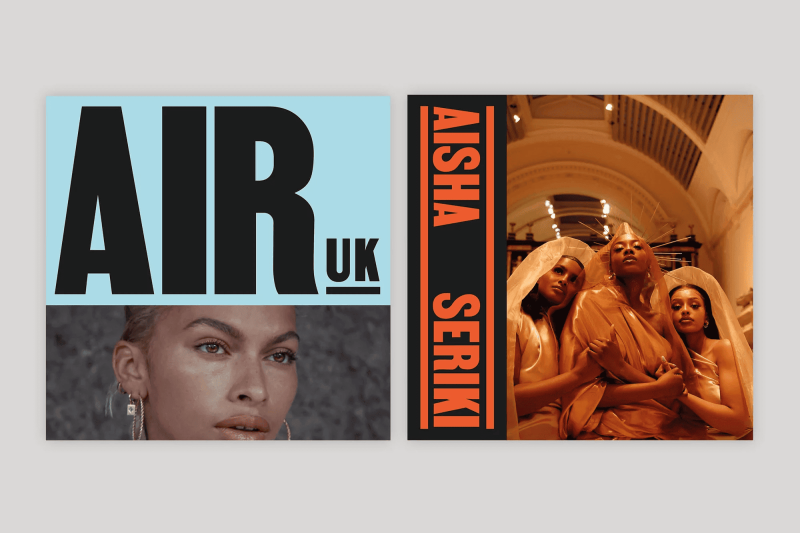

Credits: Lowkey Design, Han Gao, Lowkey Design, Christopher Doyle & Co., Compagnie et Cie, Koto , Lucas Machado Design, Elizabeth Goodspeed, Millie Tyler, Yuliia Hrabynska
Bright colors, edgy typography, and quirky elements are at the heart of this 2025 graphic design trend, making everything feel a little more lighthearted. Unlike more serious styles, this one isn’t afraid to break a few rules or throw in a surprise. It’s all about creating joy and sparking curiosity.

So, what’s drawing people in? It’s the personality. Each design feels like it has its own character, full of energy and ready to grab attention. Designers are experimenting with vibrant color palettes, layered patterns, and typography that jumps off the screen or page.


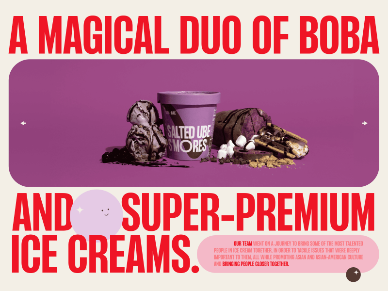
This trend works across digital and print, perfect for brands that want to stand out and show their fun side. In a world that could use a little more positivity, Playful proves that sometimes, design should make you smile.
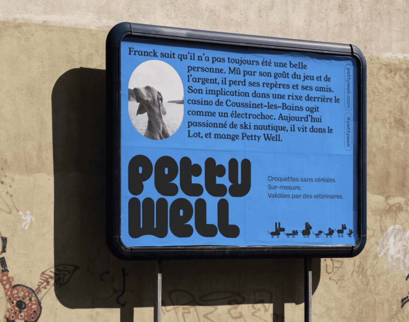
Credits: The Branding People, Mother Design, Gander, Truffl, Brand Brothers
Gone are the days when icons were just functional afterthoughts pulled from standard libraries such as Font Awesome. In 2025, custom iconography has become a brand's secret weapon. It's where personality meets purpose, and boy, does it pack a punch. We're seeing brands ditch the safe, generic icon sets for something that actually tells their story.
![]()
Think of icons as your brand's visual accent. Sure, everyone can speak the language, but it's those unique inflections that make people lean in and listen. Smart brands are crafting icon families that don't just guide users; they charm them. Whether it's through distinctive geometric styles, unexpected color combinations, or clever visual metaphors, these custom icons are turning everyday interactions into branded moments.
![]()
What's really exciting is how this trend is democratizing brand expression. It's not just the tech giants playing this game anymore. From fintech startups adding their flair to payment icons to sustainability brands reimagining environmental symbols, everyone's realizing that there's no rule saying functional can't be fantastic. The best part? When done right, these custom icons become instant brand assets. Little ambassadors that work as hard as your logo does.
![]()
Credits: Reflect Studio, Denomination, Hua Qianhua, Denomination, Carolina Pinheiro, Bleed
Photography isn't always about just capturing moments, but also about creating them, with all their beautiful imperfections and theatrical honesty. We're seeing a delicious rebellion against the sterile, Instagram-perfect shots that dominated the 2010s. Instead, brands are embracing bold, staged chaos that somehow feels more authentic than authenticity itself.
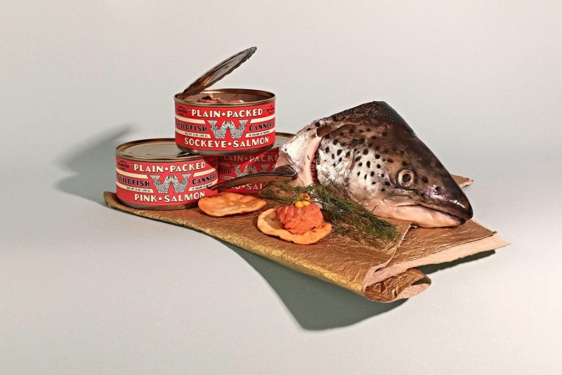
Look at how brands are playing with color stories, props, and arrangements that feel almost like still-life paintings with a twist of modern absurdity. That vintage typewriter with neon green keys? That copper bust with emerald eyes? It's this kind of intentional quirkiness that stops thumbs from scrolling. The new bold photography isn't afraid to show its strings. In fact, it celebrates them.


Photographers such as Chelsea Kyle are a wonderful example of this type of photography in action.
What makes this trend so powerful is its ability to tell stories that stick. Whether it's through carefully curated "mess," unexpected color combinations, or props that shouldn't make sense together but somehow do, these images create moments that feel both orchestrated and genuinely human. It's like walking into someone's brain during a particularly creative daydream. Everything's a little off or exaggerated, and that's exactly what makes it stand out.

Credits: The Young Jerks, Simin Xu, Designsake, Wolff Olins, Koto
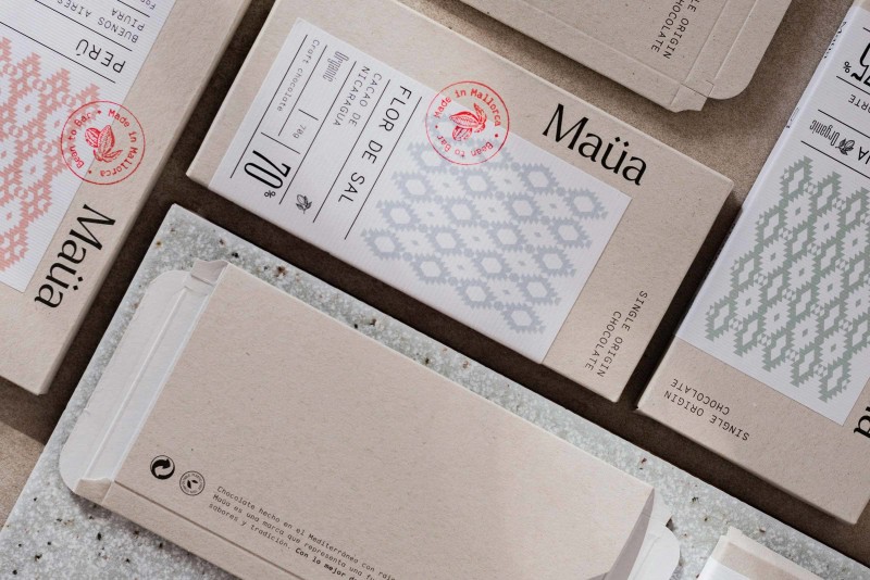
Sustainable design is becoming a new standard, and it's anything but boring. Designers are discovering that limitations breed creativity, turning limitations into opportunities that bring designers to new heights. Who knew less could say so much more?
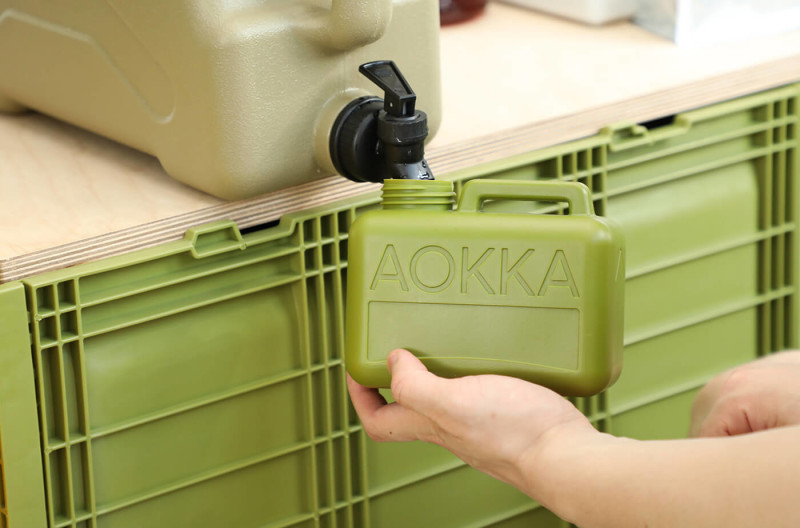
The real game-changer is how some brands are treating sustainability as a creative catalyst rather than a compromise. We're seeing designers embrace both limited color palettes and conscious material choices. From unbleached kraft paper to 100% recycled materials. Not just because they're eco-friendly, but because they're discovering their beauty. The raw texture of recycled paper or the subtle variations in reclaimed materials often create more authentic, tactile experiences than their conventional counterparts.


What's particularly exciting is how this approach is reshaping the entire design process. Designers are asking smarter questions right from the start: Could we use single-material packaging? Would this design work as effectively on kraft paper? Could we eliminate unnecessary color swatches? Maybe even go with just the one color?
The result? Design that feels more intentional, more considered, and ultimately more impactful. Turns out, when you strip away the excess, what remains isn't just more sustainable. It's often more striking too.
Credits: Lowkey Design, Boo Republic, Layout, Oilvin Park, LHCK, LHCK
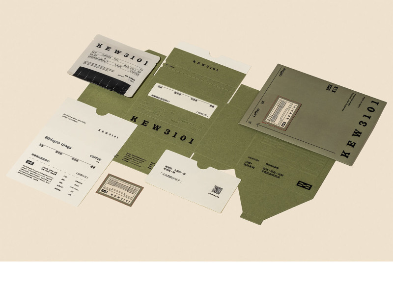
Monospace fonts are having a moment, moving beyond code editors to sophisticated design. Celebrating both pure monospace fonts and their contemporary interpretations. True monospace typefaces, once relegated to code editors, are now taking center stage in sophisticated design work.
Meanwhile, designers are also embracing fonts that capture that mono essence while it’s not always a strict mono font. Some call them ‘Fono’ fonts. Where each character of a mono font takes up the same amount of horizontal space, a mono-ish or fono font has some creative freedom here.


These typefaces bring a distinctive technical edge to modern design. We're seeing them everywhere: from minimalist brand identities and editorial layouts to digital interfaces and environmental graphics.


Credits: Barceló Estudio, Cursor Design Studio, Porto Rocha, FAST Studio, Hive
We’ll be seeing brands boldly embrace their digital DNA by incorporating familiar UI elements into their core visual identity even more in 2025. Interface components like tags, pill buttons, toggles, and dropdown menus are breaking free from their on-screen constraints to become individual brand assets in their own right.

What makes this trend fascinating is how it transforms purely functional digital elements into expressive design tools. Tech-forward brands are using oversized pill buttons as graphic devices, turning notification badges into pattern elements, and playing with toggle switches as logo components. These familiar shapes carry an instant digital association while creating a visual language that feels both innovative and intuitively recognizable.


The approach works because it's authentic. Digital-first companies are essentially saying "This is who we are" by celebrating these interface elements rather than hiding them. It's skeuomorphism or neumorphism in reverse, where UI elements make the transition to static layouts.


Credits: HALO Lab, Obrazur Brands, Obrazur Brands, FAY, André Felix
This aesthetic continues to develop, moving beyond simple earth tones to embrace a more sophisticated interpretation of organic design. What sets 2025's approach apart is its nuanced balance: pairing hand-drawn elements with clean typography, mixing natural textures with precise layouts, and combining muted earth tones with unexpected pops of nature-inspired brights. Chobani was one the first to become really big with with identity shift and many brands followed since.

This isn't just about looking organic. It's about feeling authentic. Brands are using imperfect illustrations, naturally textured papers, and photography that celebrates raw materials in their true state. The result is design that feels both grounded and contemporary, speaking to an audience that's environmentally conscious but design-savvy.


What makes this graphic design trend particularly relevant is how it reflects our changing relationship with nature. Less romanticized, more realistic, and deeply intertwined with modern life. It's not just for eco-brands anymore; it's becoming a visual language for authenticity across sectors.


Credits: How Studio, How Studio, Heitor Malheiro, Wedge, Gander
The popularity of serif fonts continues to grow. Beyond just rejecting the minimalist sans-serif era, brands are now using serifs as powerful tools for distinctiveness. Mixing contemporary serifs with unexpected layouts, dramatic scaling, and a confident amount of white space.

What's particularly interesting is how digital-native brands are embracing serifs to add seriousness and character to their identities. It's no longer about choosing between tradition and modernity. It's about how serifs can feel both timeless and surprisingly fresh when handled with contemporary design sensibilities. Pairing it up with a sans-serif typeface is a way to create a well-balanced whole.


The "great sans-serif exodus" has evolved into something more nuanced: a typography landscape where serifs aren't just a reaction to minimalism, but a deliberate choice for brands seeking to stand out in an increasingly uniform design world.

Credits: Center Design, The Branding People, Gander, Gander, Casey Roarty
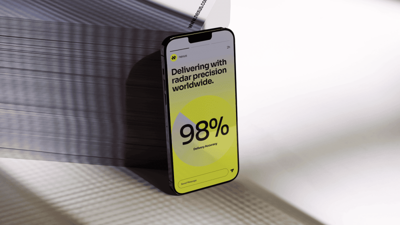
Gradients are making a sophisticated comeback, but it’s not limited to the subtle color transitions of the past anymore. Today's gradients are bold statements of identity. Whether it's through unexpected color combinations, dramatic directional shifts, or texture-like applications that add depth without feeling artificial.

What makes this revival different is how brands are treating gradients as primary design elements rather than background effects. They're using them to create distinctive brand assets, dynamic logo variations, and captivating digital experiences.


The most interesting applications pair these fluid color transitions with sharp typography or geometric shapes, creating a tension between fluidity and structure.
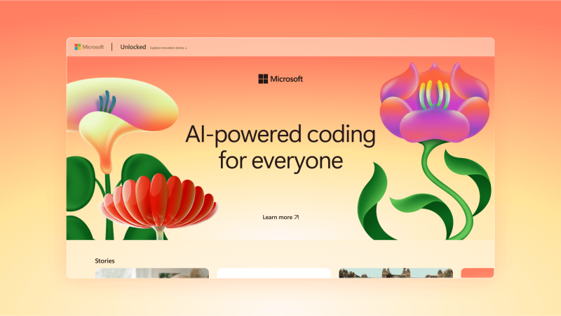
The trend reflects a broader shift away from flat design's limitations, but with a maturity that wasn't present in previous gradient trends. It's not only about making things look digital or modern anymore. It's about using color progression to tell richer visual stories.
Credits: Landscape, Ragged Edge, All Right Graphics, Koto, Halo Lab
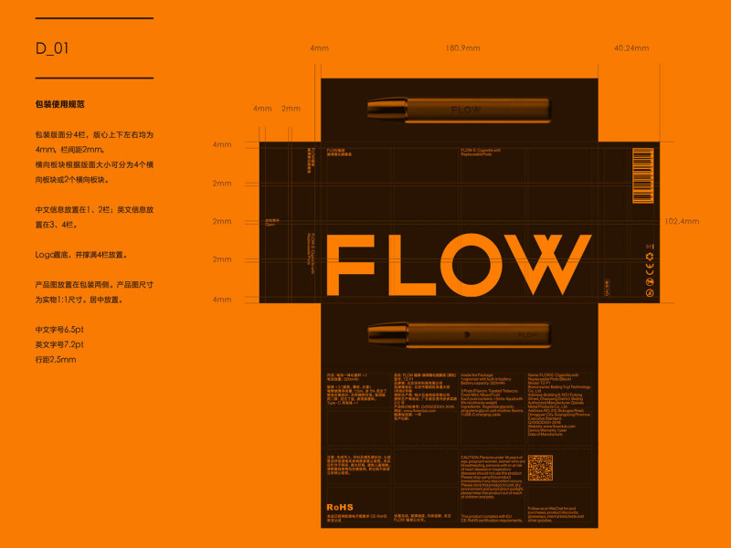
Utilitarian design has evolved beyond mere functionality to become a distinct aesthetic choice. Today's interpretation embraces industrial elements, technical drawings, and instructional graphics not just for clarity, but as powerful design statements. Think precision measurements, part numbers, and assembly diagrams reimagined as sophisticated brand elements.
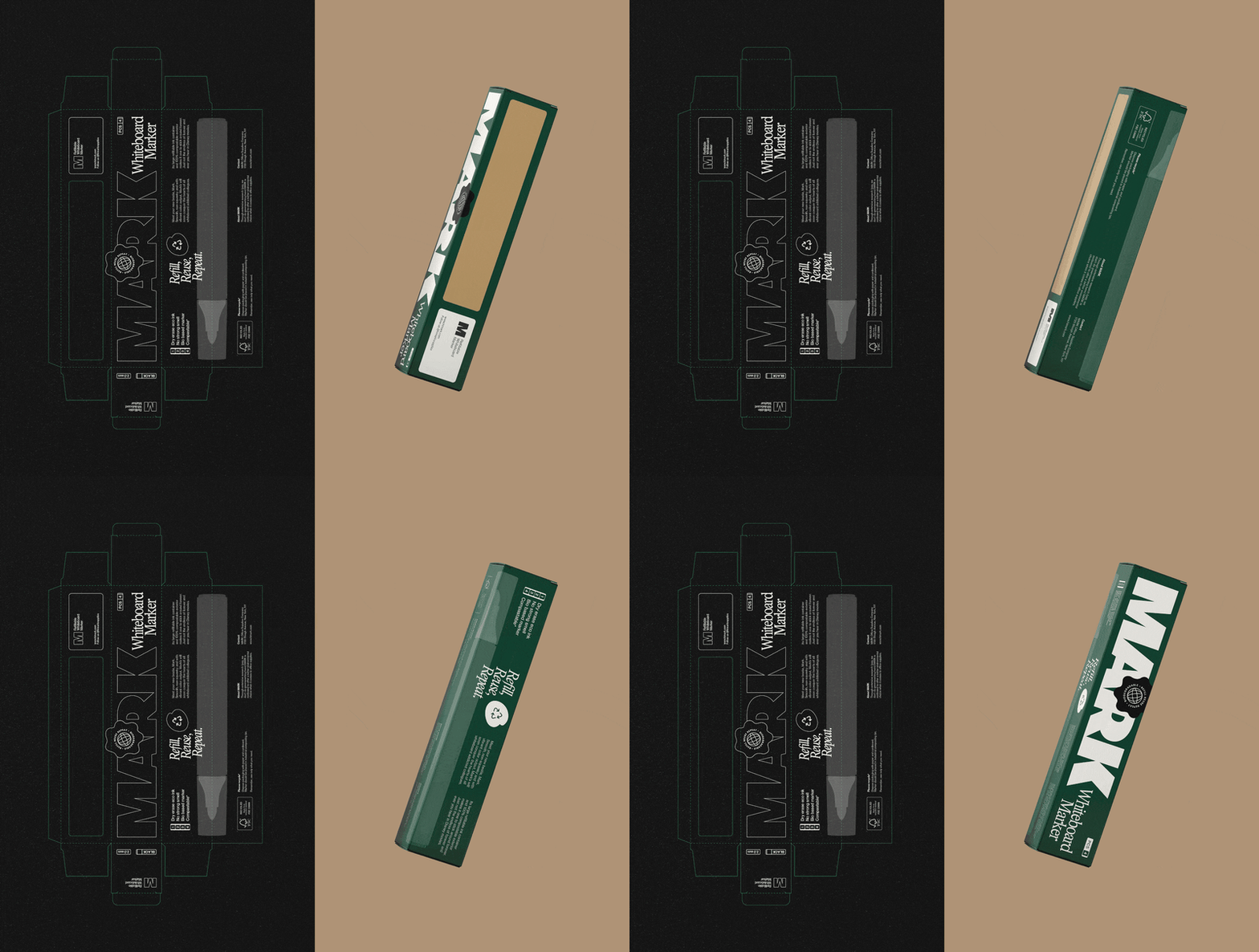
What makes utilitarian design fascinating is how it transforms traditionally practical elements into deliberate design choices. Warning stripes, technical specifications, and industrial labeling systems are being elevated into contemporary brand languages. It's particularly powerful in digital interfaces, where these familiar utility elements create immediate trust and understanding.


The approach works because it's honest about its origins. Brands aren't just borrowing the look of utility, they're embracing its entire visual vocabulary. It is function becoming form, where practical elements create their own kind of beauty. Get ready for a whole new level of sophisticated, no-nonsense cool.

Credits: Annelies Clauwaert, Han Gao, Magna, Smart Devil, Studio Atlantis
Doodles are evolving from casual accents to sophisticated design elements, proving that this type of spontaneity can be strategic and a very clever move to make if it really fits the brand. Today's approach pairs fun, organically drawn illustrations with considered layouts and typography, creating a well-balanced whole. It's less about throwing random scribbles around and more about curated imperfection.
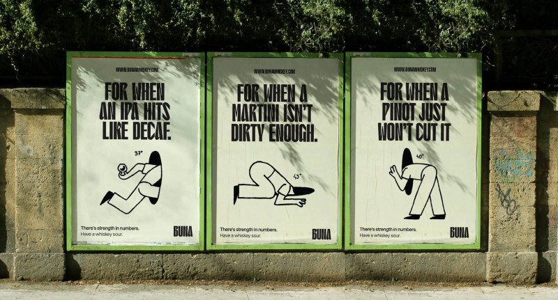
What makes doodles so powerful is how it humanizes brands in an increasingly digital, and somewhat uniform world. These hand-drawn elements feel authentic because they embrace imperfection. Wobbly lines, incomplete shapes, and gestural marks become intentional design choices. We're seeing doodles integrated thoughtfully into brand systems, where they work alongside more structured elements to create dynamic, engaging experiences.


The key shift is in the execution: these aren't just decorative additions but core elements of visual identity, carefully balanced to maintain both charm and professionalism.

Credits: Carla Palette, Kuba Góra, Wiggle, Tabasco, Podpunkt
Modular design systems are proving that flexibility doesn't mean compromising identity. Today's approach goes beyond simple grid adaptations. It's about creating brand elements that can shift, stack, and scale while maintaining their core identity.

Whether it's logos that gracefully morph from vertical to horizontal, or visual systems that intensify or simplify based on context, modularity has become a strategic advantage.


What makes this trend particularly powerful is how it solves real-world design challenges. Brands need to exist everywhere from app icons to billboards, from complex websites to simple business cards.


These modular systems allow seamless adaptation while making sure every iteration feels intentional and connected. The most innovative examples treat limitations as creative opportunities, using grid-based thinking to create flexible solutions.

Credits: Junyoup Bong, Andrea Bianchi, Parsons, Ragged Edge, Compagnie et Cie, Michael Stone
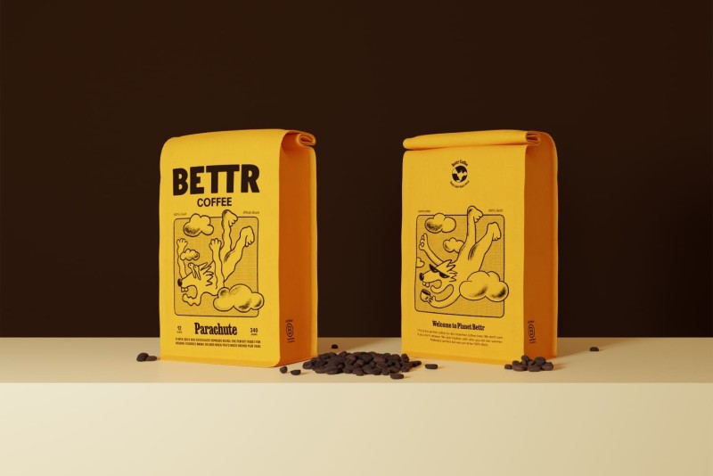
Custom brand illustrations have grown from nice-to-have to essential brand assets, offering something stock photography never could: full creative control and genuine distinctiveness. Smart brands are investing in developing unique illustration styles that can flex across all touchpoints while maintaining consistent personality and tone.

What makes this trend particularly powerful now is how it solves multiple challenges at once. Illustrations can simplify complex ideas, inject personality into technical topics, and scale across platforms without losing their impact. They're also proving more adaptable than photography for representing diverse audiences and abstract concepts while being easier to maintain and evolve over time.

The most successful approaches aren't just about creating pretty pictures. They're about developing systematic illustration languages that work as hard as any other brand asset. Whether it's through consistent character styles, color palettes, or line weights, these illustration systems are becoming as strategic as they are creative and we’re all for it.


Credits: Ochodias Studio, Pangram Pangram, Lindsey Laseter, Fishwife, Anak
Printing, and specialty printing, in particular, continues to prove its lasting value in today’s world. As screens dominate our daily interactions, there's something uniquely powerful about creating tangible designs that engage multiple senses. Here at Jukebox, we're seeing a growing appreciation for print techniques that upgrade brand experiences beyond the ordinary.
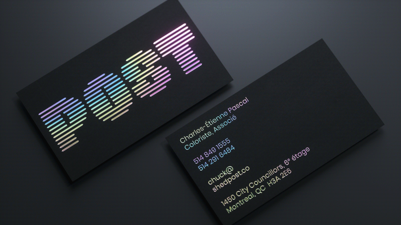
Think foiling that shifts elegantly with changing light, holographic stickers that never gets old, or custom embossing that adds an unexpected dimension of luxury to every piece. Our spot gloss effects transform simple business cards and stickers into sophisticated conversation starters, while our selection of cotton and kraft papers provides brands with that perfect balance of professionalism and authenticity.


Because in 2025, it's not just about making an impression. It's about creating lasting brand experiences that resonate in a digital age and surprise your customers with something that’s real and tangible. That’s the opportunity brands have nowadays and you’ll be surprised what it can do for your brand awareness. We often hear stories from our customers that a specialty printing choice they made has started its own life and is talked about outside their own circle. That’s what specialty printing can do.


Credits: Tux Creative, Mubien, Two Times Elliot, Hua Qianhua., Estudio Monotypo
Patterns are becoming an essential part of brand identity more and more. Once used mainly as background elements, patterns are now taking on a more prominent role, helping brands create a memorable, cohesive look across various platforms. From abstract shapes to organic textures, patterns add depth and personality in a way that feels fresh and engaging.

This graphic design trend is all about consistency and recognition. Brands are using unique, custom patterns that reflect their style and values, making them instantly recognizable to audiences. Whether bold and colorful or subtle and intricate, patterns offer a versatile way to communicate a brand’s essence.


In a world where standing out is key, patterns give brands a creative edge, making every touchpoint feel intentional and uniquely theirs. Brands are realizing the power of custom patterns to use on their branded wrapping paper or tissue paper or anything else for that matter.

Nowadays, we see patterns being a part of brand identity deliveries more and more and it’s only logical for brands to have a set of their own.

Credits: Nomonde Mtetwa, LETTERA7, Indego Macao, FAENA Studio, SCD
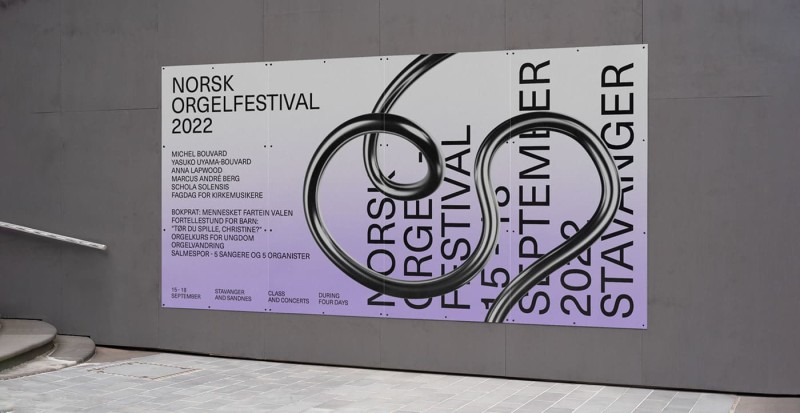
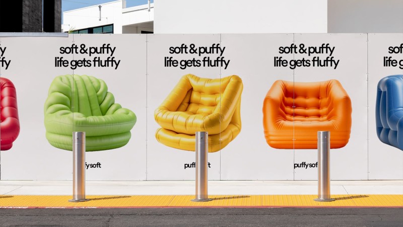
3D design is set to reach even higher heights in 2025, proving that this graphic design trend is here to stay. With advanced tools becoming more accessible, designers of all skill levels can now dive into the world of 3D, making it more popular than ever. Software like Adobe Illustrator continues to expand its 3D capabilities, allowing creators to add depth, texture, and realism without needing years of experience or specialized training. Their "Inflate" feature is still very popular and is getting updated regularly.

What’s driving this graphic design trend forward is its ability to make visuals feel tangible and immersive, adding a “wow” factor to both digital and print projects. From detailed product mockups to playful, animated icons, 3D design offers a fresh, dynamic way to capture attention.


As the tools get easier to use, expect to see even more brands embracing 3D, making visuals that feel both futuristic and approachable. AI tools such as Adobe Firefly, Midjourney and Dall-E are making it easier than ever before for people to experiment with 3D design. While Cinema 4D is still the go-to software for the “real deal”. This trend in graphic design brings storytelling to a new level, letting brands make a memorable impact in a crowded digital landscape.
Credits: Lea Bisseau, OLaF CW, Nick Barclay, Attico36, Daniel Brokstad

Motion design is still bringing an extra layer of energy and engagement to digital storytelling. From subtle animations on websites to dynamic logo reveals and animated ads, motion has become an essential tool for brands looking to stand out. And thanks to user-friendly software, creating high-quality motion graphics is more accessible than ever.

These days, you can see animated content just about everywhere. On digital billboards, social media, and even in outdoor advertising in unexpected places. Motion design lets brands add depth and personality, whether it’s a looping GIF or a full-scale animated video. The power of movement helps messages come alive, drawing in audiences and making digital spaces feel more vibrant and interactive.


Credits: LoyalKaspar, My Name is Wendy Studio, Pablo Jordán Vilches, Tabasco, Jeroen Krielaars
Stickers continue to bring a playful touch to design in 2025, adding layers of personality and fun to both digital and physical projects. Designers are now incorporating sticker-like elements in their layouts to make them feel more vibrant and engaging. Think digital bursts, emojis, or quirky hand-drawn icons. These elements bring a sense of nostalgia and a touch of personalization. They can either really look like a sticker, with a subtle drop shadow or a peeled part, or create the suggestion of a sticker by rotating these elements and throwing them on your layout.
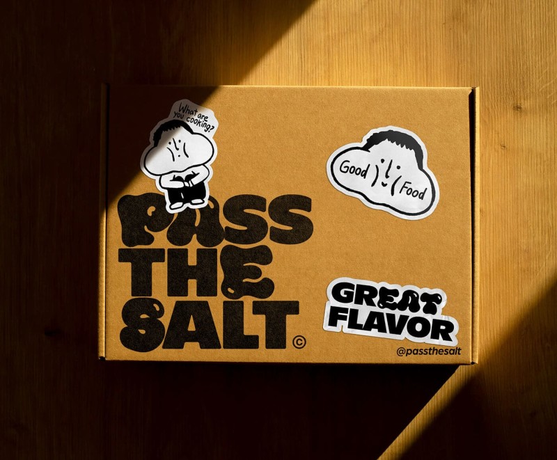
In a world where connecting with audiences is key, stickers offer a fun way to make visuals more relatable. And if you’re thinking about actual printed stickers, we’ve got you covered! Explore our custom options to add a unique twist to your branding, product packaging, or personal projects and bring your ideas to life.


Credits: Pánico Estudio, ALLGOOD, Koto, Porto Rocha, Koto
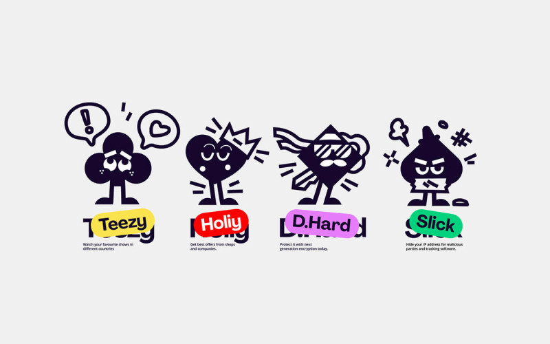
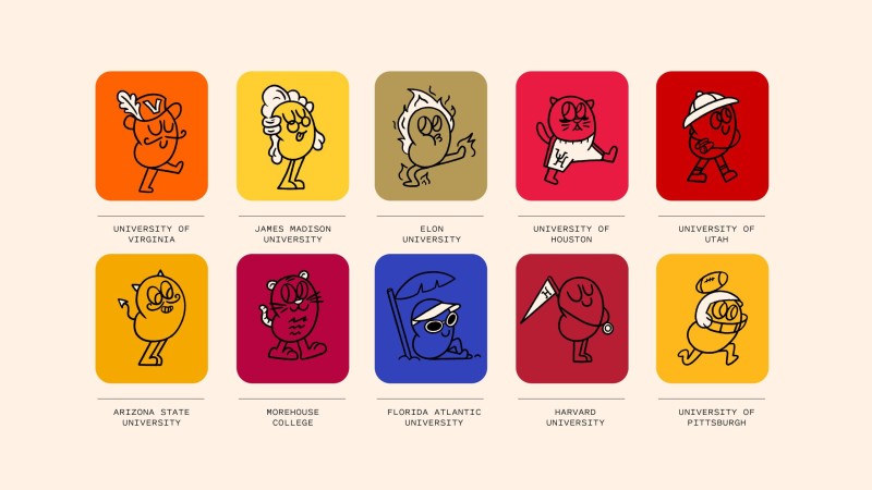
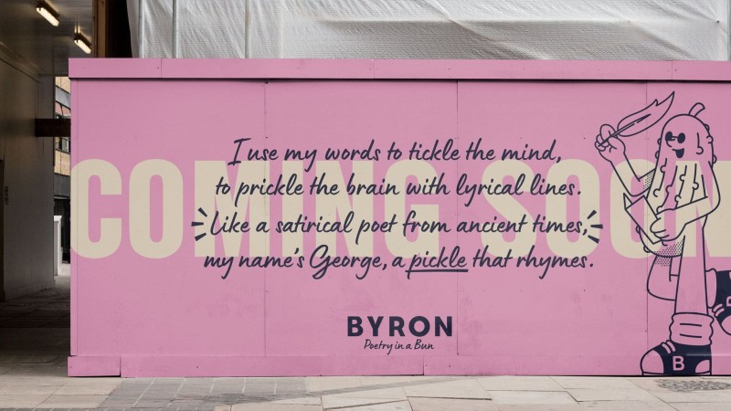
In 2025, characters and mascots are becoming more and more popular as brand ambassadors, breathing life into brand identities and building connections with audiences. These characters, whether whimsical mascots or sophisticated avatars, bring a sense of personality and warmth to a brand, making it easier for people to relate and engage.
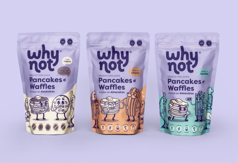
Brands are recognizing the power of a friendly face (or even a quirky creature) to tell their story and communicate values. From playful illustrations to digital spokespeople, characters add a memorable and human element, transforming interactions into more than just transactions.


As we move forward, expect to see brands using characters in innovative ways, from social media to product packaging, creating a fun, approachable vibe that audiences love.
Credits: Borondo, Junyoup Bong, Koto, Koto, Taxi Studio
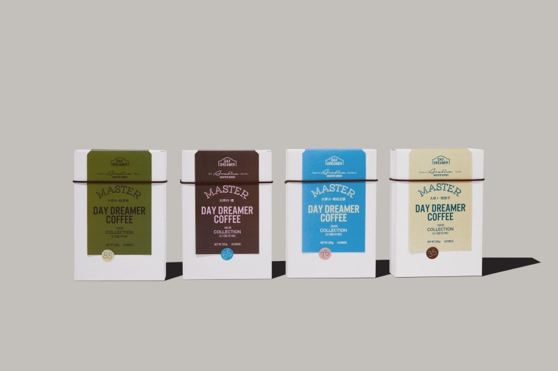
Retro-inspired design continues to grow in 2025, blending nostalgia with modern aesthetics. This trend brings back the colors, textures, and styles of past decades, from warm, earthy tones to grainy visuals and bold, vintage typography. It’s not just about looking back but capturing the spirit of a time when design was crafted with passion and personality.
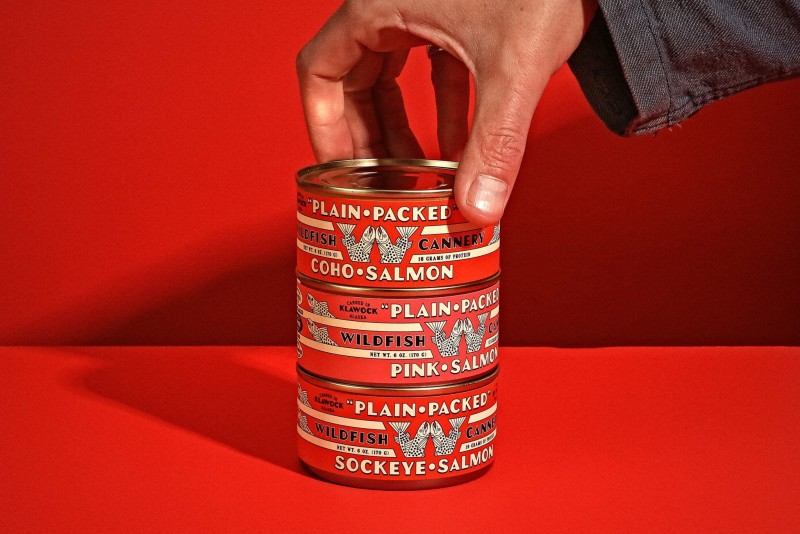
As brands and designers look for ways to stand out, retro elements offer a comforting sense of familiarity. We’re seeing retro design not only in graphics but also across fashion, interiors, media and marketing campaigns.


This year, the vintage minimalism sub-trend is gaining traction, marrying the charm of retro with a pared-down, clean look that feels fresh and timeless. Retro isn’t going anywhere and we’re expecting to see even more of this in 2025.

Credits: The Young Jerks, Fons Hickmann, Pizza Hut, Iseless, Ljudje
Gone are the days of sticking to basic, boring fonts. Now, designers are cooking up quirky, one-of-a-kind typefaces. Playful serifs, wonky curves, mixed character styles, and fun baselines. The weirder, the better!
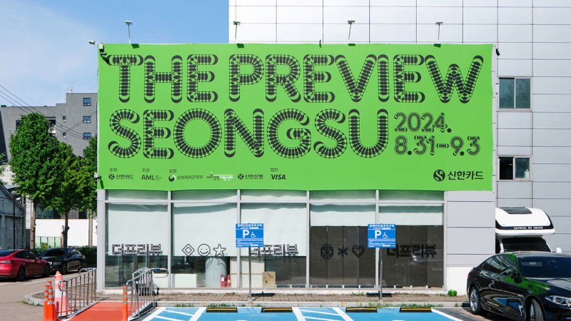
But it's not all about starting from scratch. Designers are also taking existing fonts and twisting them up, layering and colliding the letters in new ways. This adds a fun, unexpected element that makes the type the star.


Why all the typographic experimentation? Brands want to stand out and connect with people. A little typographic flair can make a big impression and help you remember a company. In a world of similar-looking stuff, expressive typography is a refreshing change.


Also, accessible font software like Glyphs and open-source editors such as FontForge means anyone can create their own font with ease and might be a huge factor in seeing so many “strange” fonts nowadays and we’re loving it. There’s even a tool called Calligraphr that lets you create your own fonts based on your handwriting in a jiffy. Very cool!

Credits: Jun Hong, SnapDesign, Stephanie Specht, Omse, COLLINS
This is all about embracing the power of “more” and turning up the volume on design. Maximalism is a bold, unapologetic style that layers colors, textures, and typography to create an eye-catching visual experience. This trend says goodbye to subtleness, inviting designers to fill every corner with vibrant elements that make a statement.

In a world where minimalism has ruled for years, maximalism brings a refreshing sense of freedom and creativity. From oversized fonts and intense color contrasts to intricate patterns, it’s an art form that demands attention. Perfect for brands wanting to stand out, maximalism’s energy and personality make each design feel dynamic, bold, and anything but quiet.


Credits: Studio Alinéa, Nick Barclay, Antoine Pilette, Gander, Michael Bierut
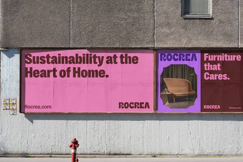
Geometric shapes are transforming from mere design elements into powerful brand storytellers. Brands are embracing a sophisticated revolution, reimagining these type of shapes and forms to create eye-catching identities.
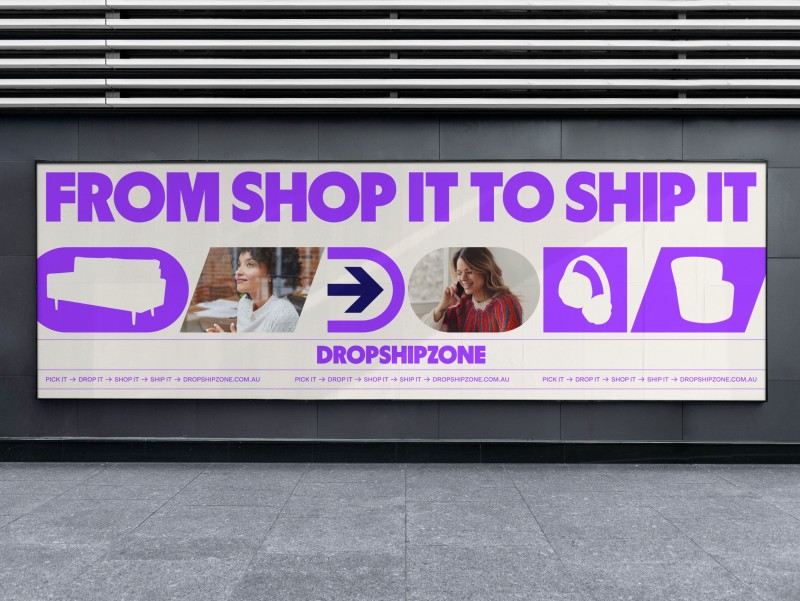
This trend goes beyond basic squares and circles though. Designers are experimenting with complex patterns, unexpected compositions, and strategic layering that adds depth to every visual expression. The versatility of geometric design allows for its application across a wide range of media, from digital interfaces to physical packaging.


Brands are leveraging geometric grids for a variety of touchpoints, developing identities that strike a balance between boldness and refinement. The beauty of geometric design lies in its ability to communicate without words, you can even play with these shapes to make them work as abstract icons or build custom brand patterns with it. The possibilities are endless.

In the years ahead, the focus is not just on using shapes, but on making them meaningful, allowing brands to forge deeper connections with their audiences through the strategic use of these timeless design elements that often bring a layer of joy to a brand.
Credits: Christopher Doyle & Co., LIT Create, Mezcla, Fellow Studio, Hosam Brands
Our squared friend named “pixel” is (still) having its renaissance moment. In 2025, pixels are changing into something far more sophisticated and designers take the creative freedom of either going really small and detailed, blowing them up, and using them as a tiled grid.
![]()
We're seeing them break free from their rigid roots, even blending and rounding them up to create a new type of form while keeping it recognizable as our beloved digital brick.
What makes this trend so captivating is its duality. The genius of the pixel trend is how it's being used to bridge the gap between our digital and physical worlds. These aren't just decorative elements, they're visual metaphors for the way we live now, constantly moving between online and offline spaces. Although, it can stand for that. It’s also a very rewarding design element for a brand to have because it’s so versatile.
![]()
![]()
Credits: A LINE, Anthony Lam, Niccolò Mamprin, SPACE10, Halo Lab
As we fly through 2025, these graphic design trends are more than just aesthetic choices. They're powerful tools for brand storytelling and audience connection. The future of design isn't about following trends without thought, but about understanding how they can authentically uplift your brand's voice.
Whether you're refreshing your visual identity or launching something entirely new, let these insights guide you along the way. At Jukebox, we're excited to see how you'll interpret these trends and bring them to life through print. From innovative materials to cutting-edge finishing techniques, we're here to bring your boldest design ideas into tangible prints.
Want to explore how these trends could work for your brand? Our team of print experts is ready to collaborate with you on your next project. And for those hungry for more inspiration, stay connected. We'll be releasing more deep-dive spotlights throughout the year.
The future of design is here, and it's more exciting than ever.
Find more design inspiration on the Jukebox blog.
Stay ahead of the curve and get ready for the new year with 24 of the biggest graphic design trends for 2024.
Nov 1, 2023
•
8 min read
Your go-to guide with 50 fonts to keep an eye out for in 2024 to help you pick the perfect font for your next design project.
Nov 6, 2023
•
4 min read
Not to worry. Enter the email address you used when you joined and we’ll send you instructions to reset your password.
We've sent you an email with a link to reset your password.
Check your spam and promotions folder if it doesn’t appear in your main inbox.
Didn’t receive the email?

