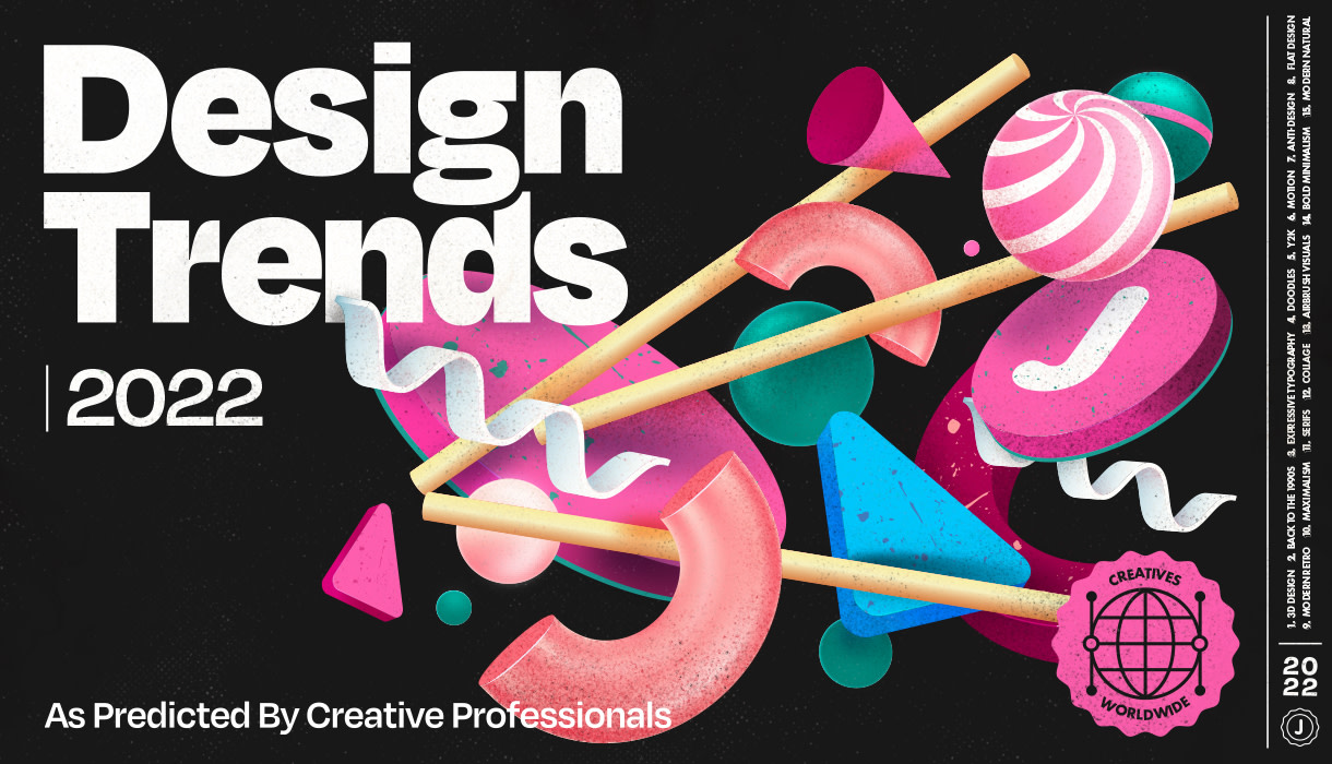
As we’re entering a new year in graphic design we wanted to point out some of the biggest trends that we saw rise up in the course of last year and will probably become even bigger in 2022. While modern and futuristic visuals such as 3D design got more and more popular over the years, we also saw a nostalgic response to all those pixels and renders as Retro inspired trends became widely used again. So let’s dive in and see how 2022 will look like, if you’d ask us.
3D Design
Since software development to create 3D artwork has not stood still, it’s much easier to get your hands on it was a few years ago and this certainly shows the released work since then. Tools like Cinema 4D and even the latest updates from Adobe are making it possible to dip your toes into the 3D world and start making your own three-dimensional artwork. And while it was all about realistic proportions a while ago, artists are now exploring new styles and are moving boundaries which results in many refreshing visuals.


It’s not solely about full size visuals but about creating branding elements as well. This way isolated 3D visuals can be a part of the identity and live throughout the brand. Using a 3D character for your team instead of the standard snapped portraits? Why not. Turn a specific phrase into 3D instead of typing it in Arial, absolutely!


In the last months of 2021 the world of NFTs completely blew up and this will undoubtedly result in a wider audience looking to become more skilled in this area.

Back to the 1990s
We’re quite nostalgic ourselves as well and the era of bold visuals keeps on being a trend, just as it should be. It brings you back to ‘better’ times where everything was just, simpler. This visual style contains so many characteristics that turned out to be quite timeless and looking at released work from last year, we’ll surely keep on seeing a lot of this style in this year as well.


Grainy 3D visuals, bold colors, simplified shapes, patterns, bubbly typography, thick outlines and everything in between. And because this style has so many different aspects to it, the possibilities are endless and creatives keep on playing with them too bring back the joy of that time of day.


Expressive Typography
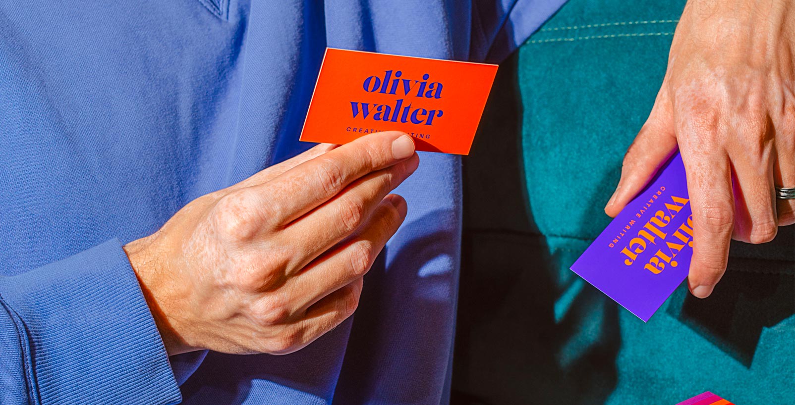
The primary function of typography is to be legible, functional and should bring over the message, whatever that may be. We would agree on that but in a time when we all come across so many messages on a daily basis, we need something to stand out, grab someone’s attention and then convey the story you want to tell. Typography is an art form on its own and can be used like that. Why not give those letters full attention instead of being secondary to photography or illustration? Print campaigns such as postcards will be popular then ever with this artistic approach.


Because whether it’s custom lettering or a real nice typeface, letters are art and can definitely be used like it. One of the best examples of this was this year’s Spotify’s Wrapped. People kept talking about the condensed typography and why that was a bad, or a good thing. Spotify’s creative team gave the leading role to the typography and I can only applaud them for doing that. Hopefully we’ll see more of these big brands make this kind of leap.

Doodles
After many years of clean vector visuals, brands tend to bring back more character and some human feel to their brand. Visuals don’t have to be pixel perfect anymore as businesses want to get closer again to their customers and be more approachable now they feel they became another brick in the wall.


Whether it becomes the main illustration style for the brand, use it as smaller elements throughout the brand, creating scribbled typography or whatever in between, using doodles for your brand can turn the identity around and lets you come across as playful and fun.


Y2K
Y2K, also known as Kaybug, is a bright and playful aesthetic that still has some characteristics from the 90s era but with the use of more complex materials and focused towards technology. Named after the Y2K Bug, which refers to the potential computer errors that could happen on January 1, 2000. Many programs represented four-digit years with only the final two digits, making the year 2000 indistinguishable from 1900. When this didn’t happen, this led to an intense optimism about technology and it got completely embraced by the masses.


Most Y2K aesthetics rely on the use of technology and an overall futuristic look using complex, iridescent gradients and low poly CGI. Some elements of Y2K could also be recognized as Vaporwave since it shares the same retro futuristic vibe.


Motion
After the static imagery was the logical way to advertise outdoors for many years, the moment it could ‘move’ was considered something magical. We’re so used to static images nowadays that it’s hard to get our attention, which could be considered a good thing for the receiver of course. But for the brand that wants to send out their message this couldn’t be more different.
The evolution of technology over the years made it possible to advertise with motion in much more ways than before. Now you can see small billboards at bus stops, outside a mall or randomly placed in a city square. Brands don’t need a million dollar budget anymore to show their brand in motion and doing this creates another layer of depth in the brand.
When Mitch Paone, partner and creative director at DIA Studio got the question: ‘But why is motion so important anyway?’, he explains. “On a superficial level, a static image can't compete with a looping gif. On a deeper level, movement creates identity, just like how we can identify a salsa dancer versus a hip-hop dancer. The dancer could be the same, but their motion tells the story.”
When done right, the reach that the brand gets will be sky-high when looking at some popular examples from last year. The Fortnite X Balenciaga billboard at Times Square for example is one you’ve probably spotted on social media. It surely was an expensive ad to create and displaying it one Times Square isn’t cheap as well, but the amount of total views it got on social media made that price more than worth it in terms of brand exposure.


Anti-Design
For many years designers have learnt to play by the rules and keep whatever you want to communicate very clear and easy to understand. You can be creative, but stay inside the box when it comes to functionality and clarity.


It was just a matter of time designers would start to push back and this aesthetic, which almost feels like a movement, is called ‘Anti-Design’. Often called ‘Brutalism’ as well (which is a bit different but let’s put that topic aside), this style is all about pushing boundaries. Graphic design is an art form as well and can be defined by exploration and experimentation.


While it could come across as ‘sloppy’ and ‘ugly’, it definitely takes a fair amount of skill to create a well-balanced composition and because it’s about expression doesn’t mean it should all be considered ‘good work’. ‘Breaking the rules’ is perhaps not the right word to describe it because you still need to adapt the basic rules of graphic design to create something ‘good’. Maybe ‘Bending’ or ‘Flexing’ the rules would be a better way to describe it.


Flat Design
This aesthetic style has proven over the years to be a real keeper. The style evolves a lot but it’s mostly kept within this same term. Flat design is all about leaving things out and keeping it simple or as they say, flat. It’s not solely about keeping it as simple as possible anymore as flat illustrations nowadays contain a bit more detail than they used to.


When we’re talking about illustrations or character design, using flat design will give the freedom to break the rules on anatomy and ‘how things should look like’ while leaving out tons of shadows, small details and any additional effect that gives it more dimension. Like the name itself, keep it flat. Keep it simple.
This will also be a great benefit when you need to print it. Sure, we can print even the most complex designs nowadays but it gives you so many possibilities when your visual is more simplified.


Modern Retro
Modern Retro was definitely one of the biggest styles from 2021 and will probably only grow this year. Using the retro aesthetics from the 1970s together with modern layouts turned out to be one of the most loved styles out there. It’s so versatile that it could be applied in many ways and when done correctly, it really stands out from the ‘modern’ designs as it brings so much character to the table.


Retro typography, natural color palettes, small manual inspired elements and nostalgic illustrations are often used to set the right tone. As shown it could be used widely and let the brands stand out when doing it correctly.


Maximalism
This style is all about rejecting the common rules of graphic design that you should keep it minimal. ‘Less is more’. Maximalism believes ‘More is more’ and with the use of bold color combinations, layered images, prominent typography and repeating motifs this style definitely grabs your attention.


The use of variable fonts became a huge aspect in this style as well as it lets you maximize the use of space by switching your typography between condensed and expanded. And using all the space you have available is something maximalism is all about.


Serifs
Not a visual style on its down but definitely a trend from the last few years that has only become more and more popular. After big brands like Mailchimp and Chobani paved the way for the Serif to make its comeback, many brands followed.


It could be seen as a solid response to all the sans-serifs that became the go-to decision for many brands and there needed to be another way to build a brand. It even became a meme of all the brands that ‘lost’ their identity and gave in to the trend that was called the sans-serif.


Serif typefaces surely give a specific kind of vibe to a design. Give it a fun and approachable look with a rounded serif like
Cooper, or go for the more serious and high-end look with a hairline serif like Argesta.


Collage
Collage is definitely a design trend you will see a lot this year. Already popular for many years, the retro inspired collages that popped up everywhere years ago isn’t necessarily the style that’s used today. Nowadays, many designers use it in a much fresher style than it used to be which makes it much more accessible for the wider audience.


Instead of emphasizing the ripped paper vibe, most of the time vector shapes are now used to mask the images and are often placed in modern layouts. It’s not necessarily about creating new ‘worlds’ using different images anymore. It now can be a part of the brand identity and be used to carry patterns, photography and illustrations.


Airbrush Visuals
In a time we see more and more nostalgic styles make their return, this specific style started to be accepted again by a wider audience throughout 2021 and is set to win over even more hearts this year.


The use of those smooth brushes gives your visual a 3D effect with a certain amount of magic. It makes you look a little bit longer at that visual, and that’s exactly what you should want as an artist right? We’re excited to see how creatives will keep on using this style and what kind of surprising projects will be built around this.


Bold Minimalism
This industrial looking style has been popular for many years now but it keeps evolving over time. We all remember those years that you couldn’t go wrong with a lot of white space and some Helvetica but luckily you’ll need a little bit more nowadays to deliver something great.


Combining industrial elements like small icons and badges adds depth to your work and makes it much more interesting to look at. Often the typography plays the leading role in these designs as well and when a quality font is used, those shapes and letterforms can fulfill that role perfectly. Like we mentioned in the Expressive Typography section, letters are artforms on their own and Bold Minimalism is just another tribute to this.


Modern Natural
Earthy tones, handmade illustrations and characteristic typography. Just some of the main elements of this style that brings you closer to nature than most other styles do. It works great for organic products and businesses that care about the planet and conveys a certain honesty about the company.


And in an era in which people are becoming more and more aware of global warming and their behaviors regarding consumption and the way they live, it’s more than logical an aesthetic style like this would become widely used by brands and creatives.


There’s more under the sun regarding graphic design trends but we summed up 15 of the biggest styles on our radar. This industry evolves very fast and we’re excited to see what will be released throughout the year. The creative industry is getting more and more attention and with the rise of NFT’s and digitally made art in general, this will only grow for many years to come.
Now you know about the biggest Graphic Design Trends of 2022 it would be helpful to know what the most popular Font Trends are as well right?
To help you guide the way through all those different font styles, we listed 10 of the most popular trends out there at the moment together with some font options. So whenever you start a new project, we’re here to make that process of looking for the perfect font a whole lot smoother.
We wish you a creative year and you’ll know where to find us when you need to turn your design into something physical like Business Cards, Custom Stickers, Postcards or anything else


