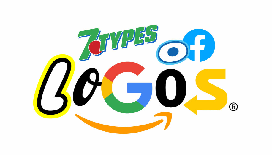
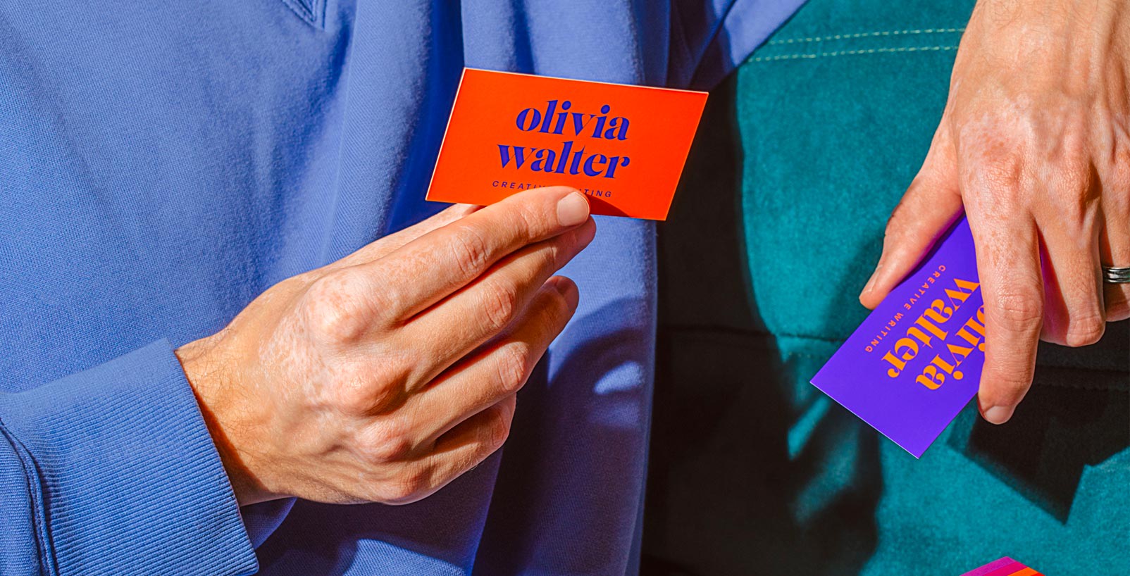
A logo is more than just a graphic. It is the visual shorthand for your brand's entire mission. In the landscape of 2026, where attention spans are measured in milliseconds and digital presence is everything, your mark must be both unmistakable and adaptable. Whether you are launching a startup or refining a legacy, choosing the right category for your identity is the most critical design decision you will make. Often, this mark is the first element you will place onto your business card templates to set the tone for your professional presence.
“A logo doesn’t sell, it identifies.”
Paul Rand
1. Wordmark (Logotype)
A wordmark relies entirely on custom typography to build brand authority. It is the purest form of identification, placing the company name front and center without the distraction of a symbol. In 2026, wordmarks have evolved into kinetic systems. Think of how Google or Netflix use their letterforms to move and adapt across different interfaces. This style is perfect for brands with punchy, memorable names like Sony, Uber, or Visa, where the font itself conveys the brand's personality, from high-tech precision to heritage luxury.


2. Monogram (Lettermark)
When a business name is long or complex, the monogram acts as a streamlined signature. By focusing on initials, brands like HBO, HP, and IBM turn multi-word titles into compact, high-impact icons. This approach is highly effective for global entities like NASA or CNN, where a simple set of letters becomes a recognizable stamp of quality across all media. The key to a 2026 monogram is legibility. You must ensure that whether it is on a tiny smartphone screen or a massive billboard, the character of the typography remains clear.


3. Abstract Mark
Abstract logos move away from literal imagery to communicate through geometric emotion. Instead of showing a product, they represent a feeling or a movement. The Nike swoosh represents speed and victory. The Mastercard circles represent connection. The Airbnb mark symbolizes belonging. These symbols allow brands like Chase, Pepsi, and Toyota to build deep, psychological associations with their audience. In an increasingly globalized world, abstract marks are the most versatile choice because they transcend language barriers entirely.


4. Pictorial Mark (Logo Symbol)
A pictorial mark is a stylized icon of a real-world object. It is an incredibly bold choice because it asks the audience to recognize the brand through a single image. Iconic examples like the Apple icon or the Target bullseye have become so ingrained in culture that they no longer need text to accompany them. For 2026, we see pictorial marks like Instagram and Snapchat utilizing vibrant gradients and minimalist lines to stay relevant. This style is best suited for brands that want to own a specific visual concept, like Shell or Starbucks.


5. Mascot Logo
In a digital landscape that can often feel cold and corporate, mascot logos offer a human and friendly alternative. They act as brand ambassadors, building an emotional connection that simple icons cannot. The Android bot, the Reddit alien, and the Duolingo owl are perfect examples of how a character can drive user engagement. For classic brands like KFC, Michelin, or Mr. Clean, these mascots provide a face for the company that customers have trusted for decades. In 2026, mascots are making a massive comeback as brands seek to appear more approachable and person-centric.





6. Combination Mark
The combination mark is the ultimate versatile choice, merging a wordmark with a symbol. It gives new businesses the best of both worlds: name recognition and iconic branding. Leaders like Amazon, Microsoft, and Tesla use this layout to ensure their identity is clear regardless of where it appears. Whether it is the Lacoste crocodile or the Spotify waves, these brands have the flexibility to use the full mark on their storefronts while using just the icon for social media app buttons. It is the most common choice for modern tech and lifestyle brands due to its adaptability.




7. The Emblem
Emblems represent tradition, prestige, and authority. By containing the text within a shield or a seal, these logos evoke a sense of history that other styles simply cannot match. This is why heritage automotive brands like Porsche, Ferrari, and BMW continue to use them, as do organizations with a legacy like the NFL and UEFA. Even the iconic insignia style of NASA falls into this category, proving that emblems are the preferred choice when you want your brand to feel established and prestigious. For 2026, neo-retro emblems are trending, blending old-world craft with ultra-clean modern lines.


 .svg)


Finding the right logo style is a big first step, but it is really just the beginning of your brand's story. Once you have settled on a direction, you will want to make sure every other element feels just as intentional. This includes everything from choosing your popular fonts in graphic design to finalizing your overall brand imagery.
If you are currently in the thick of the design process, we have put together a few resources to help you polish your look. You can explore the graphic design trends for 2026 to see what is resonating right now, or browse our curated list of the Best Free Fonts to find a typeface that speaks your brand’s language. And, if you are working with your own photos and need a cleaner look, here is a quick guide on how to remove backgrounds from your images effortlessly.
At the end of the day, a great logo deserves a canvas that feels just as considered. Whether you choose the tactile elegance of our luxury business card papers or a more minimalist, organic feel for your standard business cards, the right finish is what truly brings your identity to life. We cannot wait to see what you create.

