Based in San Francisco, California, Audrey Elise is a creative director and brand designer who works with a variety of different companies – from small startups, to international brands.
Audrey was recently tasked with an exciting rebrand of one of Denver Colorado’s most eclectic seasonal markets. The Denver Flea is a high-energy market that features artisanal brands, local arts, live music, and craft beer. Audrey is responsible for helping the Denver Flea become “Fetch” – a retail incubation and lifestyle company that creates unique shopping experiences. Their latest brick and mortar store is an innovative retail space that features a curated collection of emerging local and national brands.
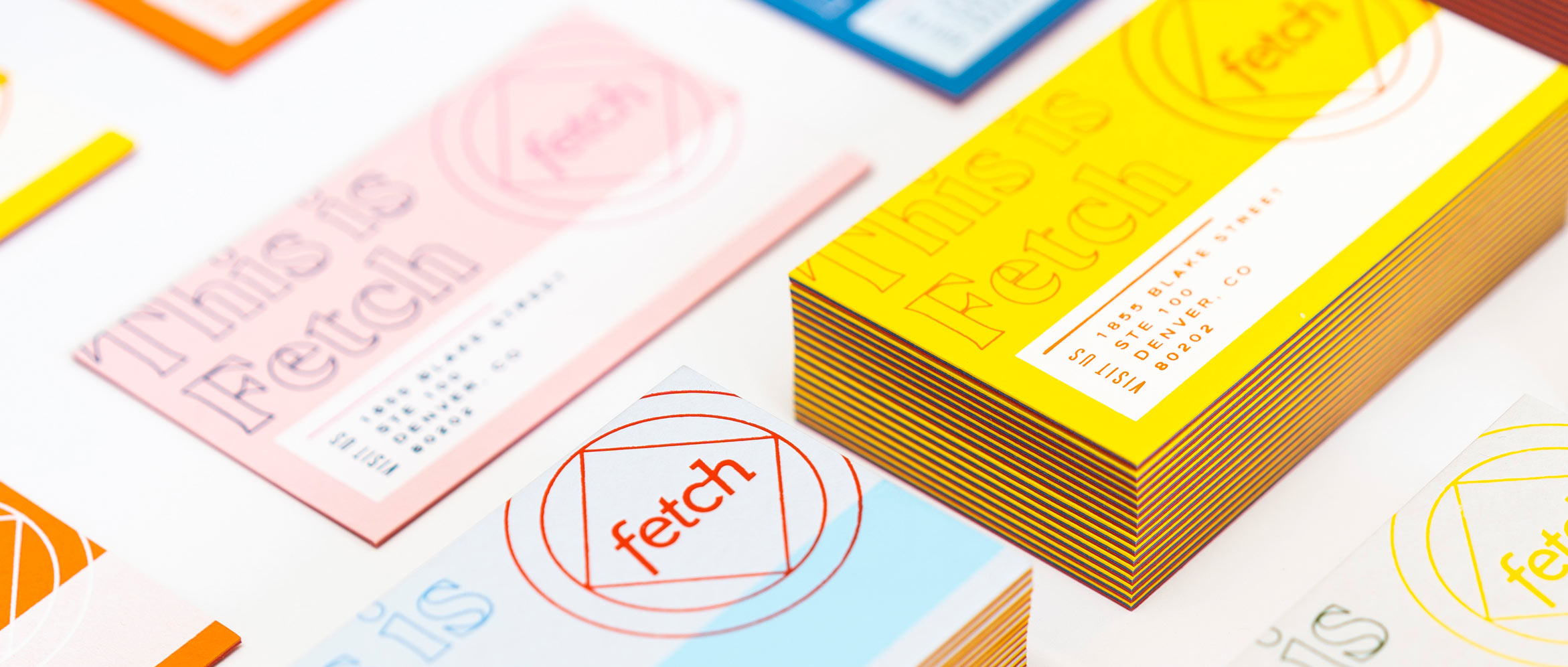
When creating the marketing materials for Fetch, Audrey found inspiration in the original seasonal markets that the Denver Flea started with. Each season that the flea was open (Spring, Summer, Fall, and Holiday) became the basis for the incredible color palette chosen for the Fetch business cards.
We were able to make a series of unique business cards that match the excitement surrounding the new Fetch retail location. We used a variety of papers and print processes that matched the seasonal palette and made for an effective means of communicating a fun and festive atmosphere.
Colorplan papers served as the backdrop for the design as well as being used as a middle layer in the cards for that extra pop of color. Combining screen printing, Colorplan, hot foil stamping, and duplexing, these cards pull out all the stops. Flat matte white silkscreen ink with the depth of impression in hot stamping gives these cards an exceptional level of dimension. Opaque foil colors that deviate from the standard golds or silvers are on display in full effect. The opaque hot stamping colors like orange, pink, white, yellow, and green add a richness to the overall design that contrasts beautifully with the rich uncoated paper stock. On top of that, added variety is mixed in by swapping out the middle layer of paper to create an unlimited assortment of color combos. Each card is completely unique and helps to strengthen Audrey's overall concept for Fetch's branding goals.
While each card is a unique blend of inspired color choices, the reverse side all share the same Colorplan Bright Red paper as the back. This adds a level of consistency to the design that fortifies the message of Fetch being a unique retail experience no matter what the season.
The cards themselves measure in at 54pt thick, one of the thickest we've ever produced. All three layers of paper combine to create an extremely sturdy and rigid card that is instantly memorable and stimulates intrigue the moment they are handed out.
By using multiple print process and a huge variety of color, Audrey is able to seamlessly move from concept to completion with an unparalleled level of quality. These business cards for Fetch are the perfect example of how to execute a brand identity that translates into print with incredible results. Bright colours and a unique print style all generate curiosity very effectively and help to build upon an interesting concept from start to finish. By building up layers of colour, you build up layers of intrigue too!
Are you a graphic designer or artist working in the world of Print? We’re looking to feature more inspired and challenging designs from creatives around the world. If you have a unique or innovative design that stands out amongst the rest – please reach out! Our Designer Spotlight Series is all about working with talented people and bringing their passion for design to the forefront.