


TUTORIALS
6 PSD Templates to Boost Your Business Card Presentation
Our fine selection of FREE PSD design mockup templates will help you cut through the noise and stand out in your industry. Click here to get started!
Sep 28, 2018
•
4 min read
4 min read
•
Nikolay Babich
•
Sep 16, 2018
Even though most of us work in paperless offices, the business card is still a vital element of a business. If you work as UI designer and haven’t got a card that you can hand out to prospective clients, you’re missing out a vital opportunity — to give a client a first impression on your work. Also, the process of sharing a real, physical card with another person creates a more memorable experience than sharing an email or phone number.
Designing business cards might seem like a simple task. But in reality, many UI designers have challenges when working on their business cards. With limited knowledge of print design, they end up with cards that look cluttered.
In this article, we’ll discuss how to apply UI design skills to design a perfect business card.
It might seem obvious, but it’s worth mentioning that a business card is a piece of printed material. Because of this, it’s essential to apply the basic principles of paper-based design to business cards:
When creating user interface design, UI designers follow a specific design process. While the process can vary, it usually contains the following steps - ideation, prototyping, and testing. The great thing about the UI design process is that it can be applied to any product design, not just for user interfaces.
Working on a business card is an exciting exercise for UI designer because a business card is something that has pretty tight constraints.
Let’s see how UI designer can use their skills to create a business card.
Ideation is a part of a design process that creates a foundation for all other phases. That’s why designers should spend as much time as required for the idea generation before starting to design anything.
Similar to any other projects, defining a goal should be the first step in the process of creation. Start by thinking about the critical information you want to include.
It can be tempting to put as much information on one card as possible. But it’s better to resist that temptation. Too much information will defeat the primary purpose of a business card — as a tool for effective communication.
Think about your business card as a pocket-sized billboard. What information you need to include to deliver the message? Generally, you should include only the essential information such as your name, your role and your contact information. If you’re working in an office, or prefer to consult face-to-face, you might need to include a postal address.
For my card, I decided to include my full name, physical address, email and personal site. I recommend adding all required information to the canvas. When all info is visible, it’ll be much easier to arrange it on canvas.

Now when you know what information you want to include in your business card, you need to think about how you want to present it. But don’t rush to your graphical editor to create a pixel-perfect design. Before designing a business card, you should sketch it. Sketching will help you to show your information in a creative way.
Experiment and draw a few examples on physical paper or in graphics editor - try to arrange details in a few different ways. Analyze the sketches, try to create a new version from existing sketches (combine elements from the best examples). Don’t try to create a perfect design. Remember your goal at this stage is to try different approaches and see what works the best for you.
For my card, I’ve tried three different placements of the information.


“Perfection is achieved not when there is nothing more to add, but when there is nothing left to take away.” This quote of French writer Antoine de Saint-Exupery is a great reminder that often, less is more.
Minimalism is a prevailing trend in UI design. The idea to provide only essential UI elements and remove everything else allows designers to create remarkable interfaces. Clear, concise, design - it’s what the most people want when hiring UI designer. You can show your clients that you’re capable of creating such design in your business card.
Here are a few practical recommendations on how to achieve a minimalistic look in your business card design:
When designing business cards, you need to plan ahead and adjust your design decisions depending on what type of card you want to have.
In my case, I would like to have a card printed with a letterpress technique. The significant advantage of this technique is that the letterpressed cards are very thick and will make an immediate impression when you hand a card to someone. At the same time, with the letterpress technique, I need to use a bigger font size.
Many designers stay away from minimalistic design because they think that minimalist design looks boring (especially when its applied to a business card). Minimal designs certainly don’t have to be boring. You can experiment with different typefaces.
Choose a font that represents the personality you’re going for (your style and taste). Would would it be - a clean and modern sans-serif or timeless serif font - is entirely up to you.
The typeface you select should not only demonstrate your personality, but they should also showcase your impressive typography skills. Play with font size and weight to prioritize essential objects such as your full name.
I chose to use a typeface called Rasa — a serif typeface with five styles. I use Rasa Bold for the headline and Rasa Medium for other information.

After that, I want to focus on creating visual hierarchy. Vary text sizes to make the most important elements (like my name) to stand out. I’ve used empty space as a functional tool to create three separate sections - my name, my address, and my contact information.

By adding additional graphic details, you can create a more memorable experience. Add a logo to your cards to reinforce your brand. Since the logo is a visual element, it creates a more memorable experience than a name alone. Even if you’re a sole freelancer, consider designing something that makes you stand apart - for example, you can create a logo from your own initials.
There is a simple trick that can help you make a particular information pop off the layout. Use neutral tones for the background and text of your card (such as black and white). Then apply a single bright accent color to the logo, and this makes the element shout.
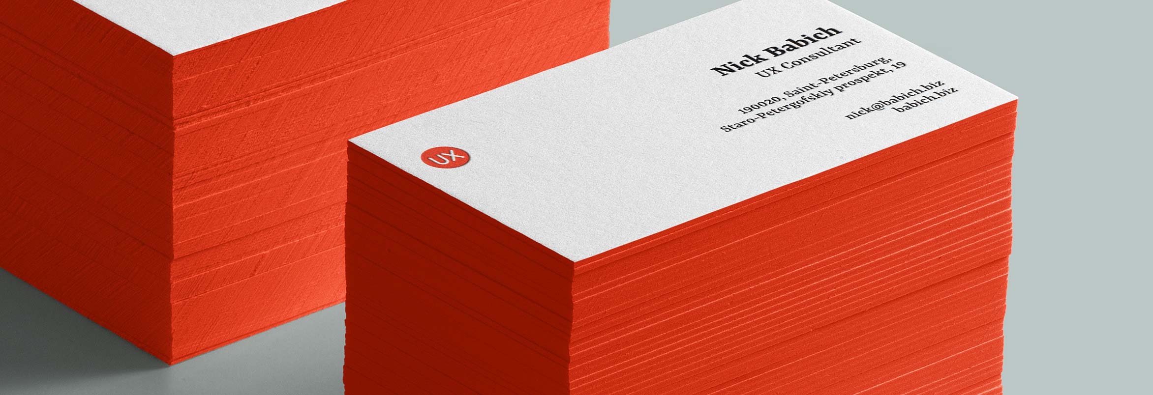
In my design, I want to achieve a perfect two colors combination. By putting a red logo (this color is called Pantone 485c) which says “UX” at the top left corner of a card we immediately grab someone’s attention.

After you choose typefaces that work for you it’s time to create a visual arrangement. It’s possible to create a better structure for your business card by using a grid. If you plan to modify your design (add or remove elements), refer to the grid for lining up text and graphics.
After applying grid, it becomes apparent that we need to adjust a few parts in our card - logo, role, and address.

Now we have a more structured design:

But still, this design isn’t perfect. If you take a closer look, it also becomes evident that we need to adjust line spacing for address and contact information. Let’s make the line height equal to 1 for that text elements.

Since I want to apply a letterpress technique to my business card, I need to be ready to increase the font size. Let’s set the minimum font size equal to 8pts. Our card will look like this on the grid.

To get all proportions right, we also need to increase the size of our logo.

This is how our final result will look like.

Nobody likes design that looks outdated. That’s why it’s important to keep abreast of current design trends and to apply them to your design.
In the attempt to set myself apart from anyone else, I decided to follow the latest trend in the world of the printed business card — painted edges. Painted edges will make my cards more unique without conflicting with my layout. The edges will be painted with the same red color as my logo.
Before sending your artwork off to the print, make sure you’ve double-checked every single detail. Nothing can be more frustrating than getting a pack of your cards with a typo in your name or email address.
Even though we live in a digital age, print business cards still have a firm place in our world. They are essential part for any business. When designed well, business card can leave a lasting impression and win you new customers.

Nick Babich is editor-in-chief of UX Planet, a popular resource dedicated to User Experience. He enjoys writing on topics related to user experience, user interface design, and visual aesthetics. Nick enjoys public speaking, traveling and cinema. You can follow Nick on Twitter @101babich

Our fine selection of FREE PSD design mockup templates will help you cut through the noise and stand out in your industry. Click here to get started!
Sep 28, 2018
•
4 min read

Also referred to as half-size business cards, skinny business cards or micro cards, mini business cards are the new kids on the block.
Aug 21, 2018
•
4 min read
Not to worry. Enter the email address you used when you joined and we’ll send you instructions to reset your password.