When it comes to minimal business cards, the devil is in the details. For a card to truly stand out and make an impression, it needs more than just minimal style; it must also have a modern twist as well.
That’s why we’ve put together this collection of minimalistic business cards from around the world. Each card includes elements of minimalism combined with a unique, modern twist that makes them stand out from the rest. From rounded corners and die-cut shapes to subtle textures and bold typefaces–these minimal cards are sure to make an impact.
15 minimal business cards from around the world
1. The Ramon Alcon

Designer unknown, date: ~1870

The business card design of the Prince of Monaco himself, this elegant yet simple creation oozes regal sophistication and the red logo at the top center is both striking and digestible to the eye.
2. The Mr. E. K Benson

Designer unknown, date: ~1870
The symmetrical black border surrounding this business card gives it a real edge and the infinite white space saturating the body serves to accentuate the font in a way that says, 'look at me'. A real gem of a minimal business card.
3. The Arthur T. Parker

Designer: Arthur T. Parker, date: 1830
This design is particularly unique as not only is it designed by its owner but it’s handmade with a calligraphy pen. This may be a time-consuming process, but if you have an expert hand, like Mr Parker here, the results are clearly sensational.
4. The Mary Baker C. Eddy

Designer unknown, date: 1850
First of all, Mary Baker was the founder of the Church of Christ, Scientist. Secondly, she founded The Christian Science Monitor, a global newspaper that has won several Pulitzer Prizes. And thirdly, this was her business card. Fun, playful and unequivocally straightforward, this card perspires personality. Oh, and don’t forget, Mary only takes calls between 3pm and 5pm.
5. The Mr. Edward A. Kimball

Designer unknown, date: ~1914
Clean business cards were all the rage, even over a century ago, and this prolific lawyer's tasteful creation is no exception. With an Old English font style and a dainty script name, this card means business - and we’re sure Mr. Kimball was never short of clients during his long and ensuring law career because of this design.

Also, what’s particularly exciting about this design is that it has a personal, handwritten message on the back - something that was commonplace over 100 years ago.
6. The Dr. Walter Wolston

Designer unknown, date: ~1889
This cute, charming and compact miniature business card (dimensions: 2.5 x 1.25") has inspiring features, including the number 46 font in the bottom left. The name conservatively displayed in the card's center is a classy yet impactful creation if ever we saw one. Check out the doctor’s opening time - one only knows what Walt was doing in between working hours.
7. The Edward A. Kimball

Designer unknown, date: ~1902
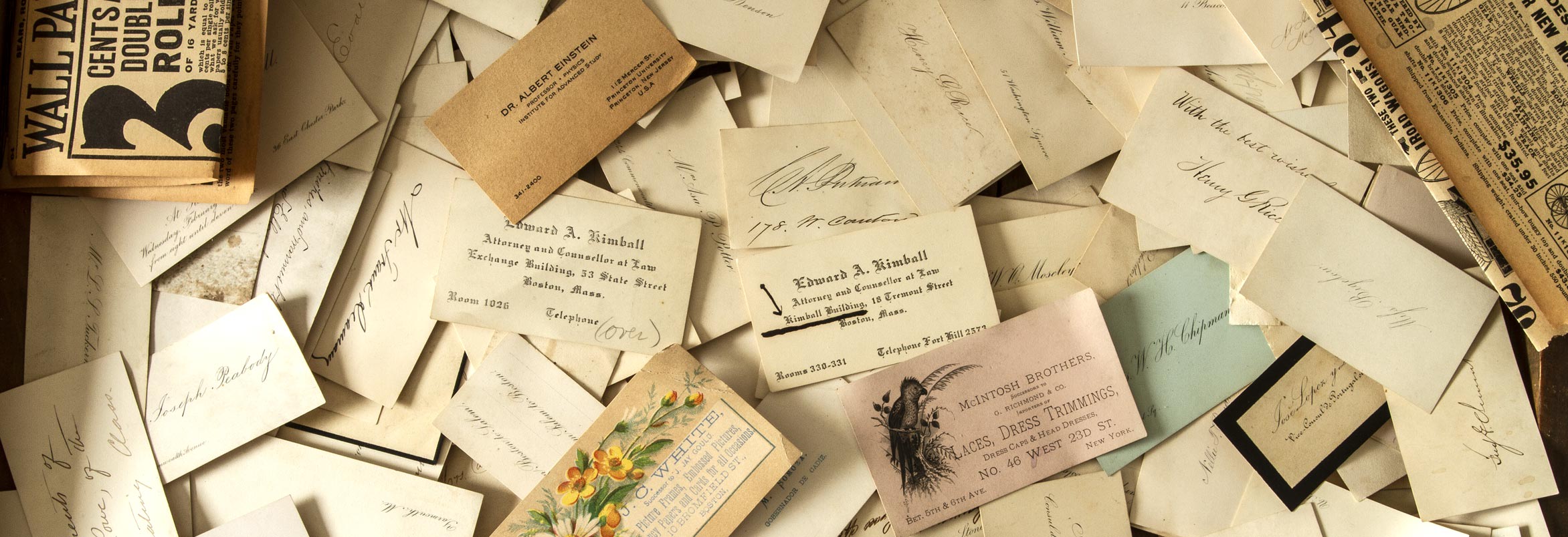
This Mr. Kimball (what are the chances of two Edward K’s in the same lineup?) loved to experiment with different styles and particularly enjoyed playing with a script and typewriter font.

Albert Einstein business card, date: ~1933
To showcase the striking sizing, design, look and feel of this particular Kimball masterful creation, here it is compared to the bronzed retro majesty of a certain Dr. Albert Einstein’s business card.
8. The Fred Burt & Co

Designer unknown, date: 1888
This script font woven into the fabric of this design is simply beautiful and undeniably elegant. What makes this card even more special is the numbers pencilled in on the side of the card - a subtle hint of genius.

9. The Miss Nellie Goldthwait

Designer unknown, date: 1888
Oh yes, people rocked rounded corners back in the 1800s, and here’s the evidence. Possibly the first-ever rounded corner business card produced, this historic creation boasts a beautiful script centred on an aging cream stock - and the forward-thinking simplicity of this design stacks up to most business cards around today.
10. The H.E. Dennett

Designer unknown, date: 1885
A cute and charming layout with a simple and sophisticated font used. Having the "over" displayed in the bottom right corner reminds everyone your next appointment is due.
11. The George Brown
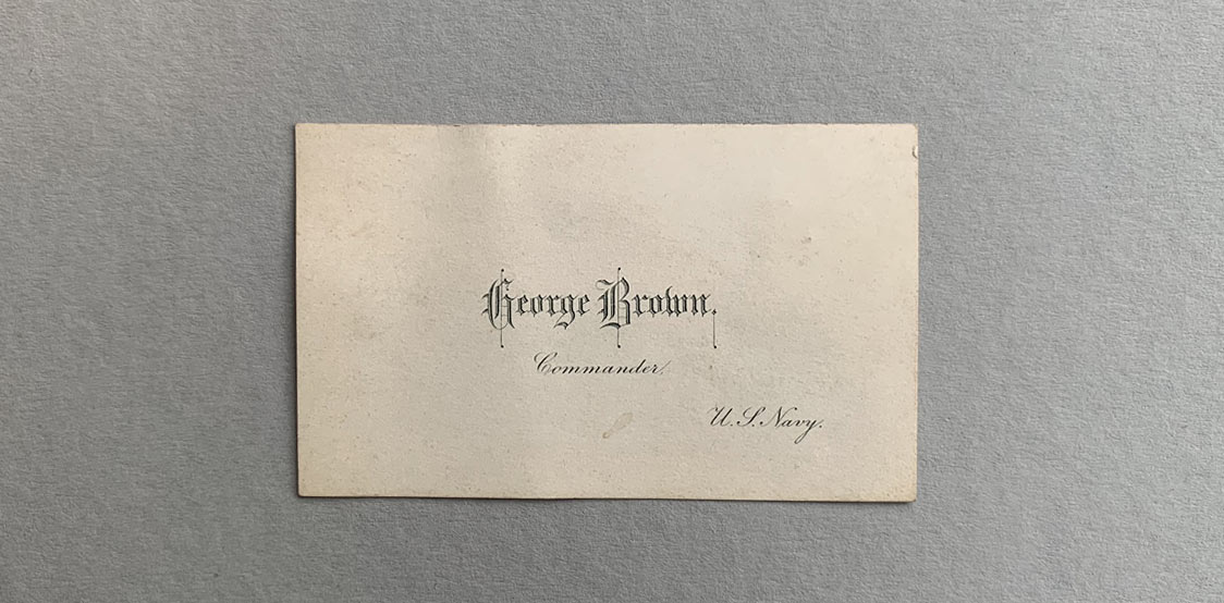
Designer unknown, date: 1866
Even a commander in the US Navy needs a simple business card design from time to time - and it's safe to say that this powerful figure indeed opted for a powerful font. The name is bold as are the hard edges of this colossal creation, yet the rest is ever so plain, clean and simple - pure class.
12. The Milo Thompson

Designer unknown, date: 1896
Simple, smooth and super classy, this italicized card shares Milo’s unique approach to personal branding while creating an air of mystique. Moreover, the font allows the white space to shine and allowing the font to shine on a luxurious blank canvas.
13. The José Merelo

Designer unknown, date: 1890

This particular creation stands out due to its deep impression and thick, soft stock - a very classy letterpress creation, indeed, sporting a beautiful contrast of creativity and professionalism. A piece of trivia here for you: El Brigadier translates to The Brigadier.
14. The Eleanor W. Brodhead

Designer unknown, date: 1889
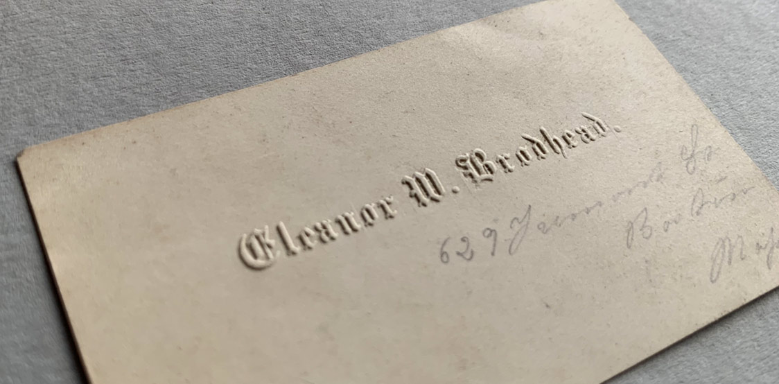
Having a blind embossed business card in today's age is considered luxury. But having blind embossed for a card in the 1800's is even more breathtaking. This card gleams thickness, texture and most of all, a sharp blind embossed texture. Ms. Broadhead sure had class and sophistication.
15. The Miss Dart

Designer unknown, date: 1866
What can we say but, wow! This amazingly simple yet savvy concept is the cream of the vintage crop, and the fact that it's enclosed in its very own miniature envelope is priceless.

A beautiful example of blind embossing.
The envelope itself is marked from Shreve Crump, a fine jewellery company from the 1770s, and the finish is impeccable. Whoever Miss Dart is, she sure has class, and bundles of it.
Choosing your own minimal business card
Once upon a time, minimal business cards were the only option available. Nowadays, minimalism is a choice and one that can be an incredibly powerful statement about your company, brand or services.
With minimalism comes simplicity. But don't let this fool you–minimal designs are no small feat to construct! To ensure success with a minimal card, it's important to set yourself a few ground rules.
The font you choose can make all the difference–avoid using too many, or overly ornate fonts that will overpower your minimal design. You should also consider embossing with minimal cards to give it a premium finish and add a little texture. Additionally, if you are including the company name, try to keep it minimal–minimal lettering or framing can be an effective way to achieve this.
Explore our free business card maker and create your own minimalist art piece today.


